8 Logos That Have A Hidden Secret
By
Editorial Staff in
Facts
On 30th May 2016
An app created by officials at Queen Mary University of London has been used in order to determine how engaging a logo is. It also creates a heat map of the most attractive spots on the logo, as well as giving the logos a "salience score." The app is called Dragonfly.
Do you know anyone that hates Instagram's new logo? SHARE this with them!
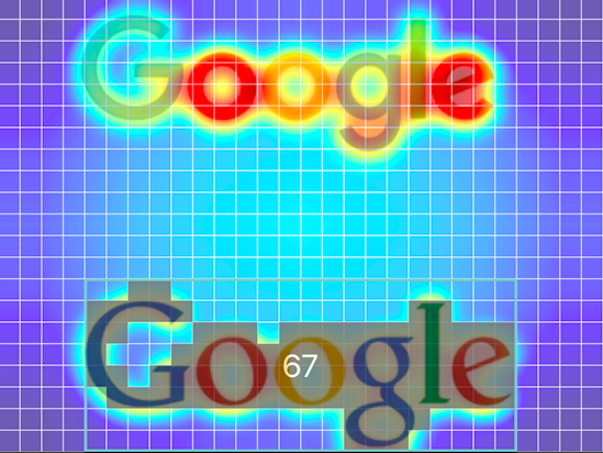
#1 Let's start this puppy off with a friendly face! Google's old logo had a score of 67, which is a pretty solid.
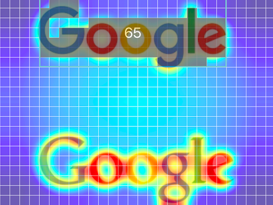
#2 In contrast, their new logo only scored 65. Dragonfly said the loop in the second "g" is the reason that the score was dropped (it drew the eye).
#3 Next up is Uber. Uber had a decent score, coming in with a 63 due to the simplicity of its logo.
#4 Here's their new logo. I'm not entirely sure what it is, which is probably why its score dropped to 53. Ouch, that's a pretty big drop.
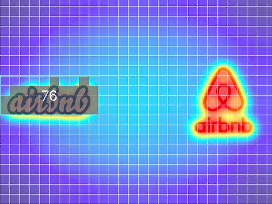
#5 Airbnb is the next culprit. They came in with a whopping 76 as their score. Bravo!
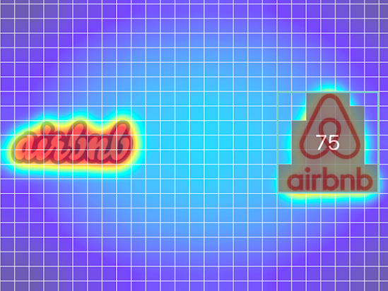
#6 Their newer logo, which I'm particularly fond of, actually scored one point lower (75).
No surprise how well their logos do, though, because their founder has a background in art and design.
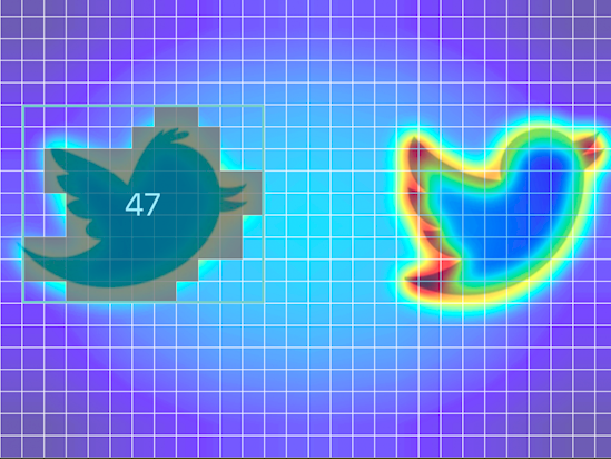
#7 This one came as a bit of a surprise to me, but Twitter's original logo only scored a 47.
One of the issues? Perhaps the beak garnered too much attention.
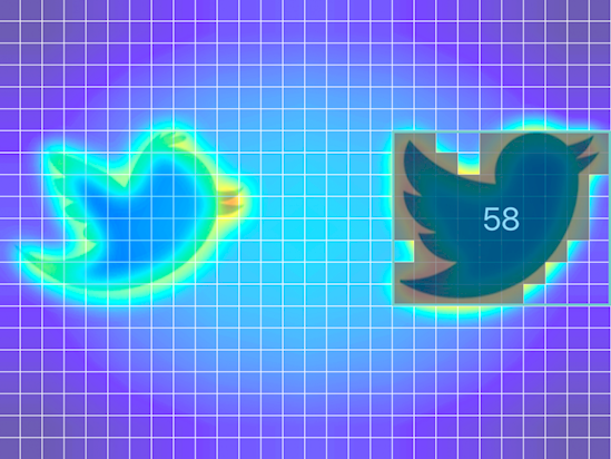
#8 This is the part I found surprising. Twitter's new logo scored a 58. That's 11 points higher!
According to Dragonfly, that's because the bird has a smoother design (no more distracting feathers on the head).
#10 Only a one-point drop, but a drop nonetheless. According to Dragonfly, the finer font and curve on the "a" are to blame.
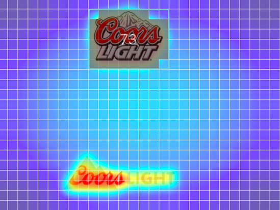
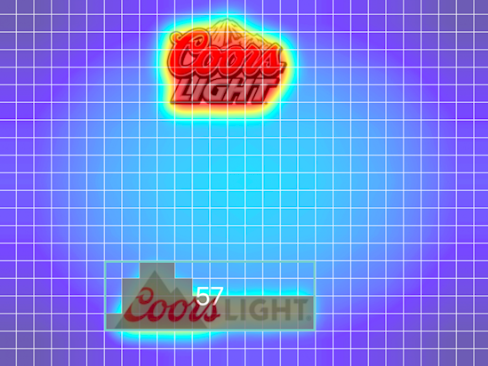
#11 Logo overload, ahh! It's time for a drink... Here's Coors Light's old logo, scoring a relatively impressive 73.
The text is packed together nicely and draws focus to itself, according to Dragonfly.
#12 Their new logo dragged them down to an embarrassing 57. According to Dragonfly, the wider logo "quickly gets washed out."
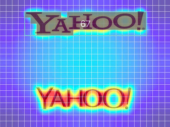
#13 Here's another familiar face. Yahoo scored a decent 67. Not too impressive, but also nothing to be ashamed of.
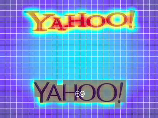
#14 While not a huge increase, Yahoo is one of the few logos to actually receive a higher score upon changing.
Their new score of 69 is, according to Dragonfly, due to the deeper purple and shadowing.
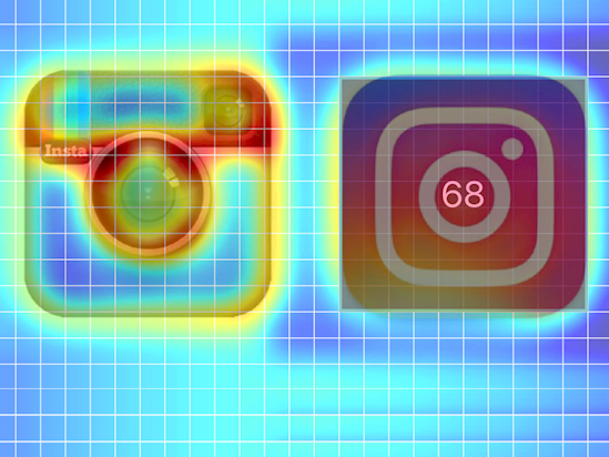
#15 Let's finish this off with the company that has been making waves.
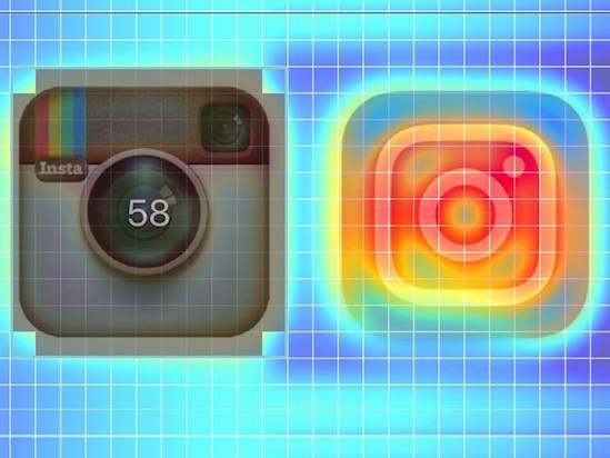
Instagram's old logo scored a measly 58. According to Dragonfly, their score banked off the nostalgic theme of the camera and the offset "Insta."
#16 Maybe it's just me, but I like the new Instagram logo.
It scored a 68, which is a solid increase from their old logo. The simplicity and color are what I find attractive, and that's exactly why Dragonfly says it scored higher.