These are the honest versions of what the logos would look like if the company portrayed their goods accurately.
advertisement
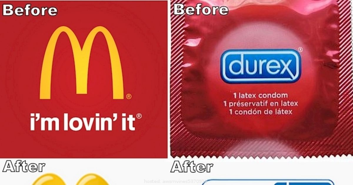
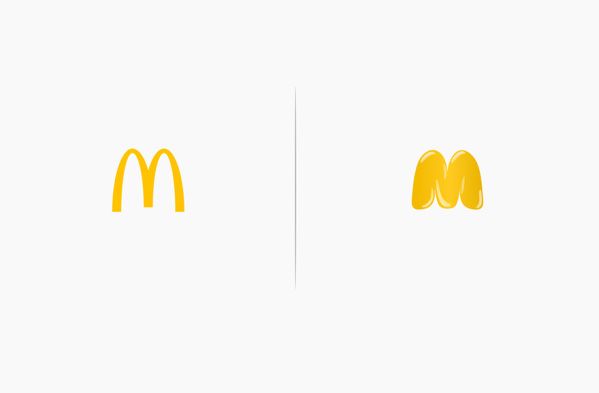
#1 McDonald's
McDonald's has never been associated with good health and this logo revamp shows just that. Notice that the golden arches are a little harder to see.
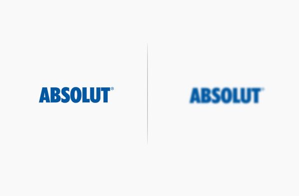
#2 Absolut
Ever wonder what the world looks like as a complete blur? Take a few swigs of vodka and you'll realize that your glasses don't help you see better anymore.
advertisement
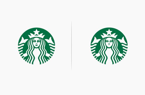
#3 Starbucks
There are two things that happen after you get your ritualistic cup of morning coffee. The first thing is that you're set aback by the cost, and then you're too wired to remember.
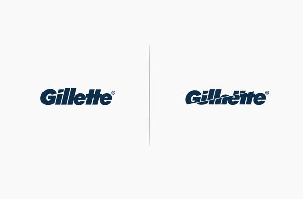
#4 Gillette
Now if only they would cut the cost of their razors... Ever wonder why beards are so in style?
advertisement
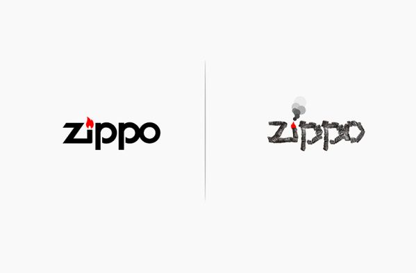
#5 Zippo
Zippo's logo looks more realistic when you actually have that burning effect. Either way though, their lighters have burned their way to the top of the fire-starting industry.
advertisement
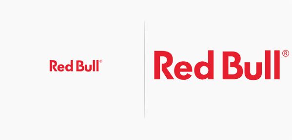
#6 Red Bull
While Red Bull doesn't actually give you wings, it'll give you the confidence that you do. So drink it up and get EXTREME!
advertisement
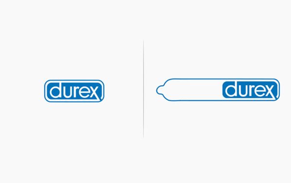
#7 Durex
Durex is high-quality contraception and since you can't 'try before you buy,' this logo sells that idea quite nicely.