Who remembers Pizza Pete, Mama Bear, or the Taco Bell before it was purple and pink? These retro fast food logos make us hunger for a bygone era.
advertisement
#1
Your favorite fast food chain may strive to get your food served quickly, but for the most part, they been slow on progress over the years. The old saying, "if it ain't broke, don't fix it" seems to be the rule of thumb as you may have noticed in some of the menus over the years. However, there are some grub joints that have ventured out and changed things up, even if just a tad, by updating or totally remaking their company logos. Some changes are minor, and sometimes the public notices the switcheroo and sometimes they don't. Here are some of the best logo updates from our favorite fast food spots.
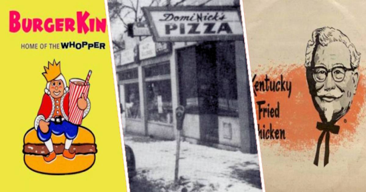
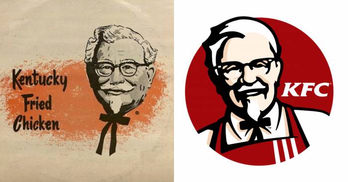
#2 Kentucky Fried Chicken
Not only did the Colonel Sanders chicken joint change its logo, it changed its name. The chain has overhauled its logo several times over the years, but it always featured the Colonel. He was changed in the 70s to look friendlier and they gave him a big smile and added an apron. In 1991 the company unveiled its new logo design and name change to KFC, then redesigned the entire thing in 1997 to what we see today.
advertisement
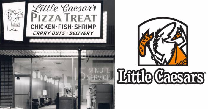
#3 Little Caesars
The original name was "Little Caesar's Pizza Treat." They got out of the fish and shrimp game long ago. It was in 1959 when Little Caesars was founded by the couple Marian and Mike Ilitch. In 1971 they created the popular slogan "Pizza, Pizza!" and began selling low priced pizzas in pairs. In 1997 the company stopped their two pizza bargain because of the expense, and also changed its logo and store branding.
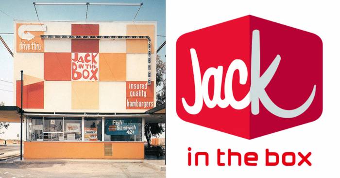
#4 Jack In The Box
Jack in the Box first opened in 1951 with a circus motif. For several years through the 1950s and '60s, Jack in the Box locations featured a number of different logos all a variation on the basic design of a clown head popping out of a colorful box. From 1970-79 they removed the clown head but brought it back by 1982. However, the company was sold in 1984 and they changed the name to Monterey Jacks, but the public didn't like the new name and stayed away. After a very public apology for the Monterey Jack's fiasco, Jack in the Box brought their menu and logo back in 1986. The remained untouched for 23 years, until 2009. That's when the current version was introduced.
advertisement
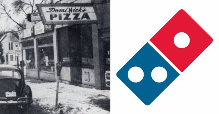
#5 Dominos
Now the second largest pizza seller in the world, founded by two brothers in a small Michigan town in the 1960's, Dominos was once just a tiny little hole-in-the-wall pizza joint. It was originally called Domi Nick's, after the brothers. The very first Dominos logo, which was created in the late 1960's, was created for two reasons. It was red, white, and blue to stand for America, and because they were told those colors stand out more than any other. The logo went through several designs over the years, flipped, on its side, and even dropping the word 'Pizza' from its name as well as the brothers names. The current logo is simply red and blue dominos and was created in 2012. People already know what the symbol stands for, great pizza!
advertisement
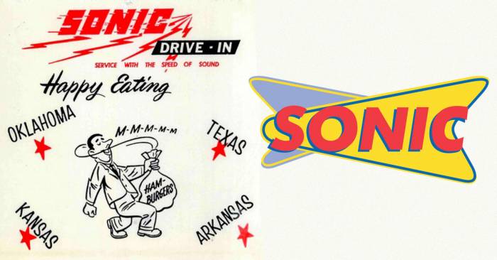
#6 Sonic
Oklahoma City-based Sonic bills itself as "America's Drive-In," and first opened in 1953. The original name was Top Hat but owners were forced to rename the drive up root beer stand when they learned the name was already trademarked. The Sonic name was introduced in 1959, and the first professional logo was introduced in 1963 when they began franchising locations. They dropped the 'drive-in' from their name and revamped the logo in 1998.
advertisement
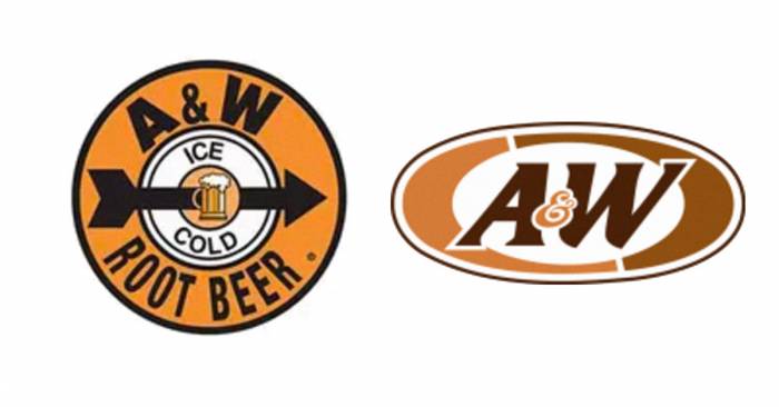
#7 A&W
The original A&W Roor Beer was not a drive up stand complete with car hops and their delicious secret root beer fountain drinks. It was simply a cart that served a brew of homemade root beer. But by the 1950s they had bears as the logo and called menu items Papa Burger, Mama Burger, Teen Burger and Baby Burger. They also sold hot dogs in several variations but were known for their root beer floats. It all started in 1919, and the beverage was served in a plain glass mug without letters or words. The A&W name was not yet used. In 1921, the letters 'A&W' appeared raised on the frosted glass mugs. By 1948 the company had begun selling it's food menu and the logo was created, a red & black bulls eye on a white background. In 1968 the colors were changed to brown and orange, and in 1995, after 7 changes to the design, including a return to the bears, the company went back to the brown and orange colors in an oval and dropped the 'root beer' from its name.
advertisement
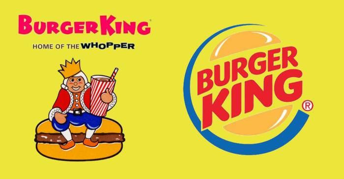
#8 Burger King
Burger King was founded in 1953 in Jacksonville, Florida, as Insta-Burger King, because the cooker was called an insta-broiler. The logo always included the KING. At some point by the end of the 1960s, the "Insta" was taken off the king's crown, and the logo was updated to reflect the prominence of the Whopper sandwich for the chain. In 1969 BK introduced the famous "Bun Halves" logo, with a rather interesting typeface. This logo lasted for a quarter century. Over the years the logo only changed slightly until 1999 when it was streamlined and included the blue circle around the bun. They briefly tried changing the company name to 'BK' but it switched back to Burger King within a year.
advertisement
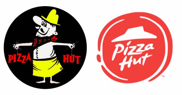
#9 Pizza Hut
The Pizza Hut logo is certainly one of the most recognized logos in the world. Its earliest version was introduced in 1958, and debuted on the signage of the roof, which only had space for nine characters, thus Pizza Hut was born. When owners saw competitor Shakey's Pizza expanding and developing a corporate theme and design, it sought an ad firm to create the logo and store color and layout we know today. During the 1060s through the mid-1980s they were known for their red roofs, and Pizza Pete chef cartoon. The current Pizza Hut logo was created in 2008 when Pizza Hut started to offer pasta items on their menu. They even stopped building restaurants with the well known popular red roofs and began opening Pizza Hut Express shops that are carry-out only.
advertisement
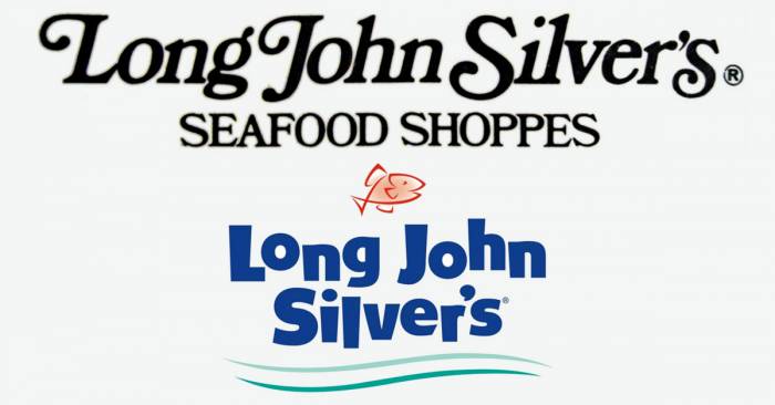
#10 Long John Silvers
Started in 1969, the name of the brand is borrowed from the novel Treasure Island by Robert Louis Stevenson, in which the pirate "Long John" Silver is one of the main characters. Formerly a division of Yum! Brands, Inc., the company was divested to a group of franchisees in 2011. But from 1972 through 2007 the company grew and expanded nationwide and was recognized for its Cap Cod style architecture and design. The logo changed just slightly over the years about a dozen times, but the current design is just blue lettering on a white background. The shoppes no longer are built like New England fisheries.
Just some extra trivia.. both Pizza Hut and Long John Silvers enlisted the voice of country music superstar Janie Fricke in the 1970s for their once popular television jingles, "Long John Silver, for the seafood lover in you," and "Let yourself go to Pizza Hut."
advertisement
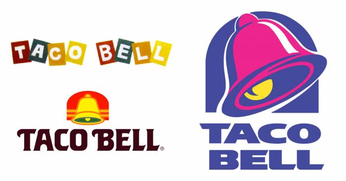
#11 Taco Bell
The current version of the Taco Bell logo was introduced in 1994 and consisted of a modernized, slanted and more playful version of the chain's classic logo. Some locations still sport some variations of the original logo, but for the most part, franchises are required to use the newer pink and blue, bell design. Another subsidy of Yum! Brands, the company was started in 1962 by Glen Bell, and the logo has only changed four times since it began. Originally the name was spelled out in various colors, then the bell was added in orange and yellow. Eventually, as the logo became synonymous with the chain, the bell was by itself until the color change in '94 and the words Taco Bell were added back on.
advertisement
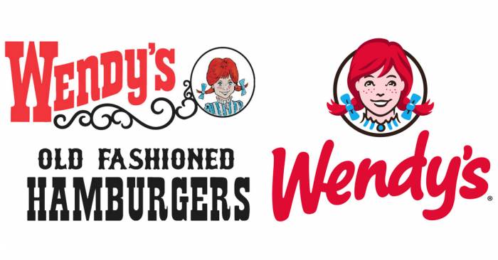
#12 Wendys
Dave Thomas founded Wendy's Old Fashioned Hamburgers in 1969 and the brand has been pretty much consistent through the years. The first logo already had the well-known Wendy's wordmark and an illustration inspired by Thomas's eight-year-old daughter, Melinda Lou "Wendy" Thomas. With just a few tweaks over the years, it was revamped in 1983 when 'Wendy' moved to the top of a more square-shaped mark, and the colors for the two wordmark areas reversed. In 2012 they did a major revamp of the logo and made the Wendy picture a little more modern looking, and switched to yellow and red lettering. They still use both logos from time to time, depending on the packaging or ad campaigns.
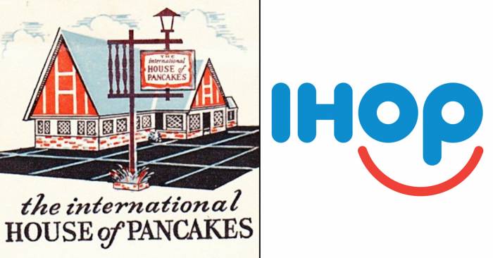
#13 IHOP
The International House of Pancakes opened in 1958 in Los Angeles, California, and began franchising within a year. The iconic buildings were blue A-framed structures that were later changed to red and white. The last one of those was built in 1979. The company logo remained virtually the same since the middle 1970s but was totally changed in 2006 when the company changed its name to the acronym IHOP. They originally had the blue lettering with a red upside down half circle underneath with the word 'restaurant'. The internet complained that the logo looked like a frown, so they revamped it in 2012 to be a smile under the lettering.
advertisement
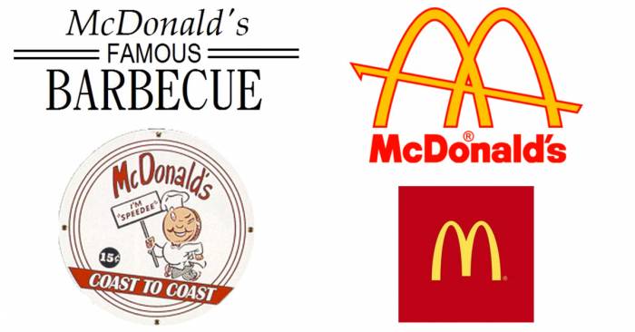
#14 McDonalds
McDonald's Famous Hamburgers opened in 1948 and began franchising in 1953 with an accent of fast food, they introduced the Speedee mascot. The first version of the classic Golden Arches logo debuted in 1962 and represented the architecture of the early franchises. The roof sloped upward from the back and its side arches appeared to interlock when viewed from certain angles. The arches and the sloped roof were phased out by 1970 and the company logo was switched to reflect the golden arches instead, with a big yellow letter 'M'. Starting in the 1990s, McDonald's rolled out several variations on the Golden Arches for use in its packaging and promotional materials, but the official corporate logo remained unchanged. That all changed in 2003 when the company undertook a drastic campaign to update its marketing and restaurant design. Enter the "I'm Lovin' It" era. That ended in 2006 and the wording was dropped from the logo, which today is either a yellow M on white backing or on a maroon background in a square. The name of the company is rarely used since the symbol is so iconic.